As it becomes easier and cheaper to monitor and record information at ever-finer resolutions in time and space, the data sets used by scientists, engineers and managers become larger and more complex. This complexity renders inadequate the tools traditionally used to visually summarize data. Now a KAUST researcher has helped to devise an analogous approach to data visualization that promises to make even complex, multidimensional data sets more accessible and informative.
“As technology advances, the measurement of complex data that varies over time or space is becoming prevalent in many fields, including medicine, ecology, biology, biometrics, bioinformatics, computer vision and finance,” said Ying Sun, Professor of Applied Mathematics and Computational Science. “There has been much progress in the development of statistical analysis tools to handle complex data; however, much less attention has been given to visualization, which is an integral step in exploratory data analysis.”
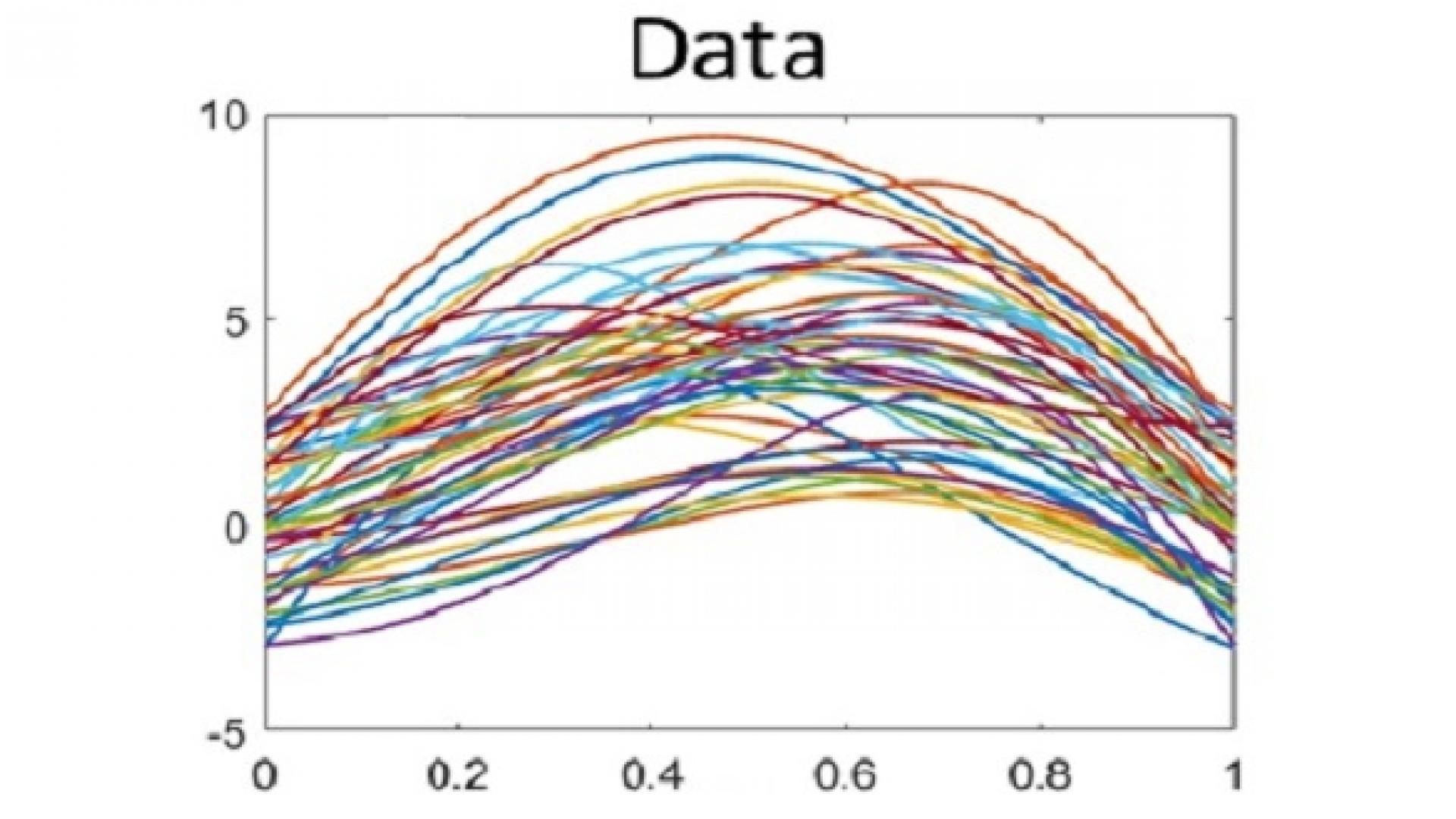
A box-and-whisker plot is a conventional visualization that involves calculating five key statistical metrics for a classical one-dimensional data set, such as the heights of a population of people. These metrics provide the average, 25 and 75 percentiles, minimum and maximum, which can then be displayed on a chart as a box centered around the average with whiskers extending to the maximum and minimum. This enables quick and intuitive interpretation of the data without the need to understand or to analyze the underlying data.
Sun collaborated with Sebastian Kurtek, a Professor from Ohio State University, and other colleagues, to apply this idea to data with a similar distribution but that had been measured over space or time; for example, daily sea-surface temperatures across many different locations. In this case, a continuous line or function of temperature variation can be drawn across all locations for each day, and plotting the data set for an entire year will result in 365 such lines drawn on one graph.
Read the full article